Case study

Building Creative Guinep

Creative Guinep is our personal brand and design system, created to showcase the intersection of UI, UX, and front-end engineering that defines our work.

Project scope: A hybrid design–engineering project documenting the creation of the Guinep brand, design system, and portfolio.
#buildinginpublic

Building guinep team building around a giant G

Define MVP layout

Rather than designing everything in isolation and waiting for a “perfect” final version, we approached Guinep the way we would approach any modern product: define a clear MVP, ship early, and evolve intentionally.

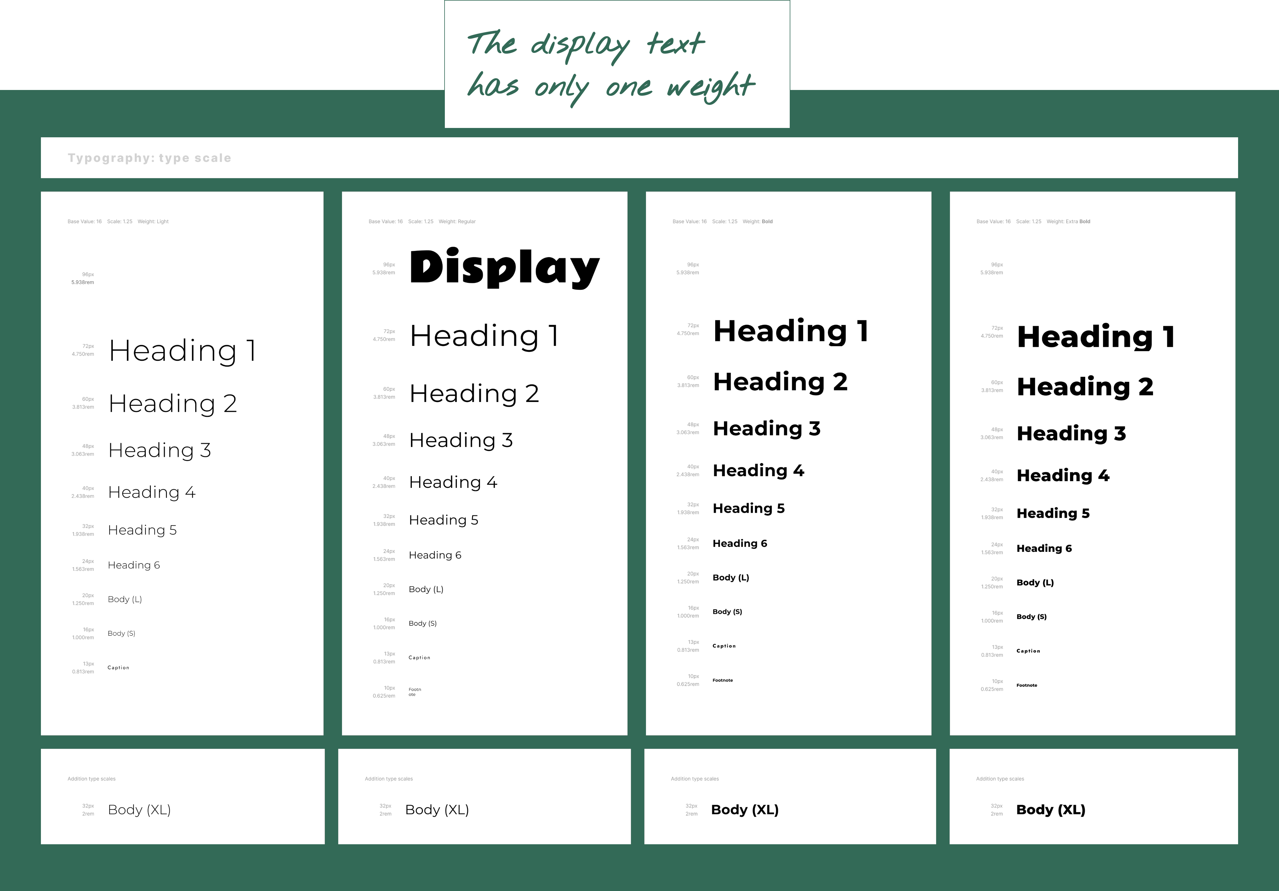
The goal for v1 was simple: establish a minimal, functional foundation that we could build on. By stripping the interface back to monochrome UI, a single type system, and essential layout rules, we were able to focus first on structure, usability, and clarity.

Each subsequent layer like typography refinement, colour exploration, component development, and interaction polish will be added through an iterative, design-system-first process.

Choose core type system

Creative Guinep needed to feel warm and creative, without sacrificing clarity or scalability. Exploring font pairings became an important part of that process.

The goal was to create a type system flexible enough to express the playful, creative side of the brand while still feeling grounded and readable for longer-form content.

Expressive display paired with a neutral body type for balance. Expressive display paired with a neutral body type for balance.

After experimenting with a few combinations, the final pairing settled on Rammetto One for expressive display moments and Montserrat, a neutral sans-serif, for the main body text.

Once the font pairing was defined, the next step was building a type scale that could support clear hierarchy while keeping the interface feeling calm and balanced.

Once the font pairing was defined, the next step was building a type scale that could support clear hierarchy while keeping the interface feeling calm and balanced.
The final scale was designed to create a consistent rhythm across headings, body text, and smaller UI elements.

Exploring modular scales using the Typescales Figma plugin. Exploring modular scales using the Typescales Figma plugin.
Exploring modular scales in-situ Exploring modular scales inside Figma design